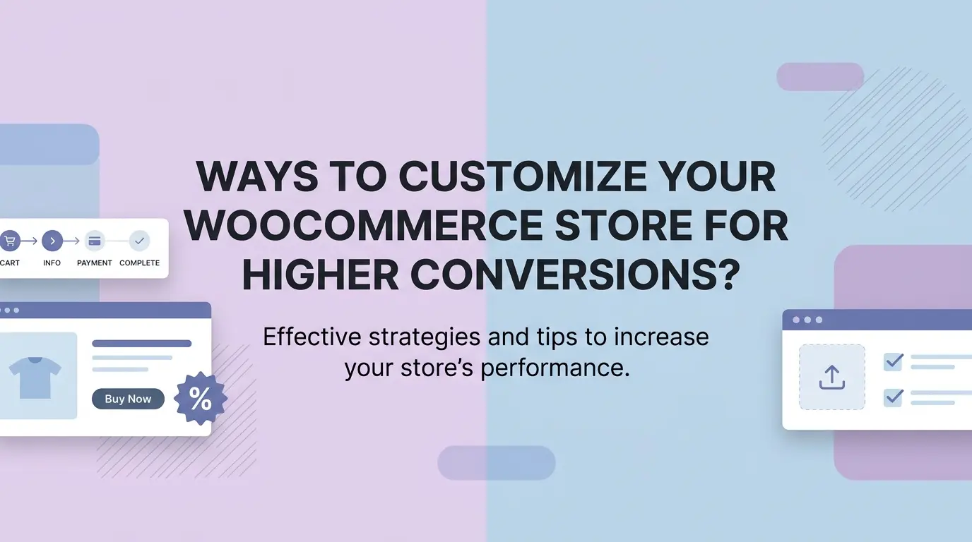
Running a WooCommerce store? That part’s easy. Getting people to actually buy once they land on your site is a whole different story. Plenty of store owners have decent traffic coming in daily and still can’t figure out why their sales aren’t moving. Here’s the thing: most people don’t want to hear, it’s rarely the products. It’s everything around them.
The good thing is that you don’t have to worry about starting from scratch with your store. If you want to shift things, just start with the smaller things, like a lighter checkout flow, better and well-optimized photos, or even just cleaning up a page that is too cluttered. This blog covers the WooCommerce customizations that actually move the needle, not just the ones that sound good on paper.
Why Customization Matters for Conversions
The default WooCommerce setup will get your store live, but it won’t win anyone over. Customers today have used enough online stores to know when something feels off, even if they can’t explain why. If your store is going to be a generic, stiff, and hard to navigate, you are basically keeping the door open for your customers to leave. And that is where your competitors will benefit, just because they put in a bit more effort.
Customization is really just the process of making your store feel like it was built for your specific customers rather than for everyone and no one at the same time. Stores that consistently convert well almost always have one thing in common: someone made deliberate choices about how the buying experience should feel, and it shows.
Simplify Your Checkout Process
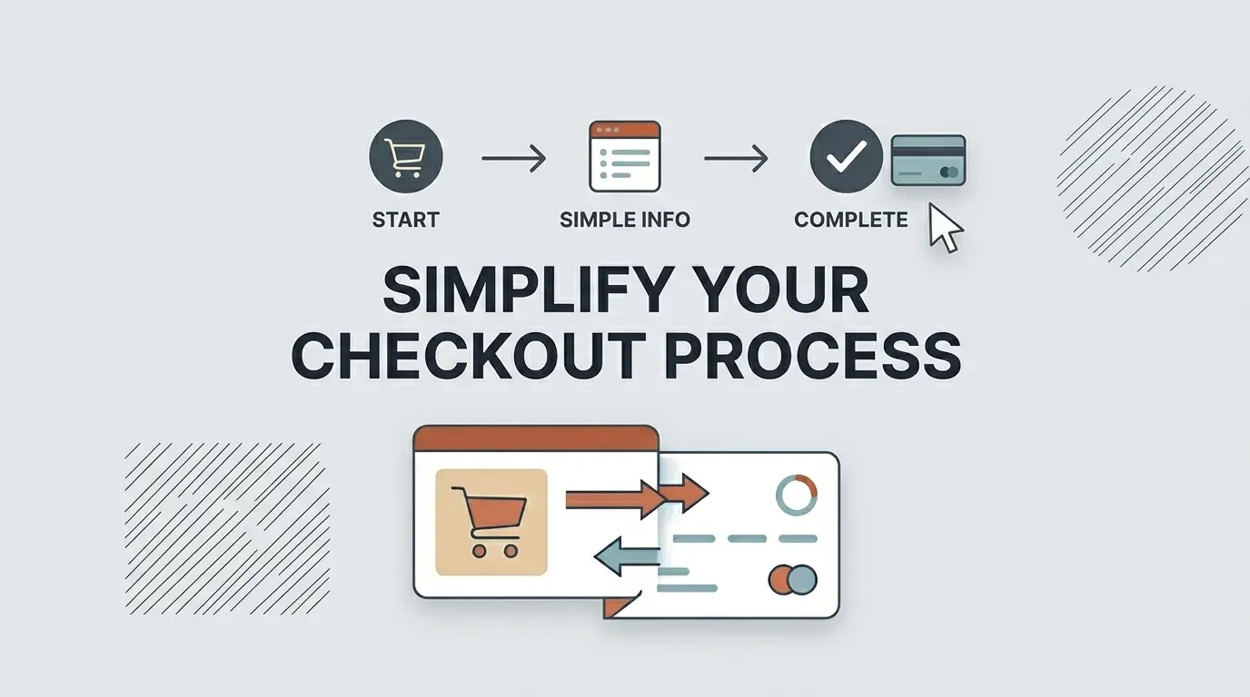
This is where most sales actually die. Not on the homepage, not on the product page at checkout. About 70.2% of all online shopping carts are abandoned before checkout, meaning seven out of ten people. If your checkout is adding any unnecessary steps or confusion into that process, you’re losing sales you had already basically won.
Remove Unnecessary Fields
WooCommerce loads up the default checkout with more fields than most stores actually need. Selling digital products and still asking for a shipping address? That’s friction with zero payoff. Mostly selling locally and showing a full country selector? Same problem.
It is better to just go through each and every field to make sure which one you need and which one you don’t. Most stores out there can leave out two to three fields without worrying about losing anything important. In the end, your customer will feel a more leaner checkout experience.
Enable Guest Checkout
Forcing account creation before someone can complete a purchase is one of the quietest conversion killers out there. People came to buy one specific thing. They didn’t come to create a profile, verify an email, or set a password for a store they may use once.
Switch on guest checkout and remove that wall entirely. If you want account signups, ask after the purchase is done; that’s when they’re actually happy and far more likely to say yes.
Use a One-Page Checkout
Multi-step checkouts give customers too many opportunities to reconsider. Each new page is basically a pause, and pauses are dangerous when someone is mid-purchase. Once you pull everything onto a single screen, you will notice how much faster the whole process feels and a lot less like a commitment.
The priority here is to shift your customer from thinking “I want this” to “Order placed”, that’s it, no second thoughts.
Improve Your Product Pages
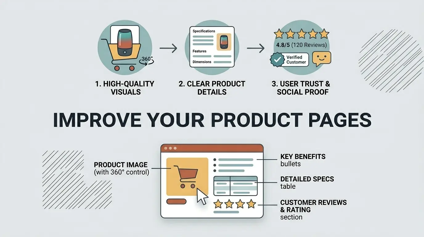
Think of your product page as the salesperson your store never has to pay. If it’s doing a poor job of communicating why someone should buy, no amount of traffic will fix your conversion problem. The good news is that most product pages have obvious room for improvement once you start looking at them critically.
Write Descriptions That Actually Sell
Feature lists are fine, but they don’t close sales on their own. In the end, your customers are buying with a focus on the outcome, not on the specifications. In simpler words, they want your product to benefit them, not something that just looks good on paper.
What problem does it solve? What would it actually feel like when using it? So you must write as if you are talking to your customers, write like you are explaining to them that the product is worth the purchase.
Add High Quality Images
Weak product photos are one of the fastest ways to lose a sale before you even had a real shot at it. Customers are making a financial decision based entirely on what they can see on screen since they can’t hold the product, test it, or inspect it in person.
Multiple angles, proper lighting, and a lifestyle shot or two showing the product actually being used, these are table stakes for any store that wants to convert consistently.
Show Reviews and Ratings
No matter how well you write about your own products, customers will trust what other buyers say more. That’s just human nature, and there’s no getting around it. Even a couple of honest reviews on your product pages can lift conversions greatly, because an undecided shopper just might consider buying it if they are convinced that others are having a good experience.
Getting feedback might also seem tricky, but all you need to do is ask your past customers via email to give a simple review. Most of them will always be willing to leave a quick review as long as you ask at the right moment.
Let Customers Personalize Their Orders
People often overlook the fact that all you need to get more conversions is to give customers more control over what they are buying. This may include options like product configuration and customization, which makes your customers feel a stronger pull to the product when making the purchase. It shifts the dynamic from browsing to owning before they’ve even hit the buy button.
Why Product Options Matter More Than You Think
Without options, a product page is basically a take-it-or-leave-it situation. Add customization, and you change that completely. For instance, the customer may want a handwritten message to pair with the birthday gift. Or, your customer might want their hoodie to be a specific color and size, probably even with their own name on it.
The person ordering a celebration cake has opinions about flavor and definitely wants custom text. None of these are unusual requests; they’re completely normal expectations. When your store can’t handle them, you lose the sale, and the customer never tells you why.
Add Custom Options to Your Products
The WooCommerce Product Addons and Extra Options plugin covers all of this without any coding on your end. Text fields, dropdowns, color swatches, checkboxes, image selectors, date pickers, you can attach any combination of these to any product in your store.
Each option can have its own price built in, so premium packaging or custom engraving updates the total automatically without any manual work on your side. Customers configure everything themselves right on the product page, which means fewer emails asking about special requests and more completed orders.
For anyone selling personalized gifts, custom apparel, food, or made-to-order products of any kind, this one change alone can noticeably shift your numbers.
Display Prices Transparently
One of the most common reasons why customers abandon their carts at the end of the purchase is the surprise shipping fees during checkout. Although the product price would have been appealing to them, once a number appears that was never there before the actual decision was made, it can be a huge turn-off.
Just by showing the real cost upfront, you immediately remove that frustration. If free shipping kicks in above a certain order value, make that visible throughout the store, where shoppers will actually see it, not tucked away somewhere they’d never look. It builds trust and quietly encourages people to add more to their cart to hit the threshold.
Use Tiered or Bulk Pricing
When customers can see that buying more gets them a better rate per unit, a lot of them will simply buy more. Not because you pushed them to, but because the math makes sense to them, and it feels like a genuine deal.
Your average order value goes up, they feel like they got a good price, and neither side had to negotiate. Set up pricing tiers for your higher-volume products and let the structure do the work for you.
Optimize for Mobile Buyers
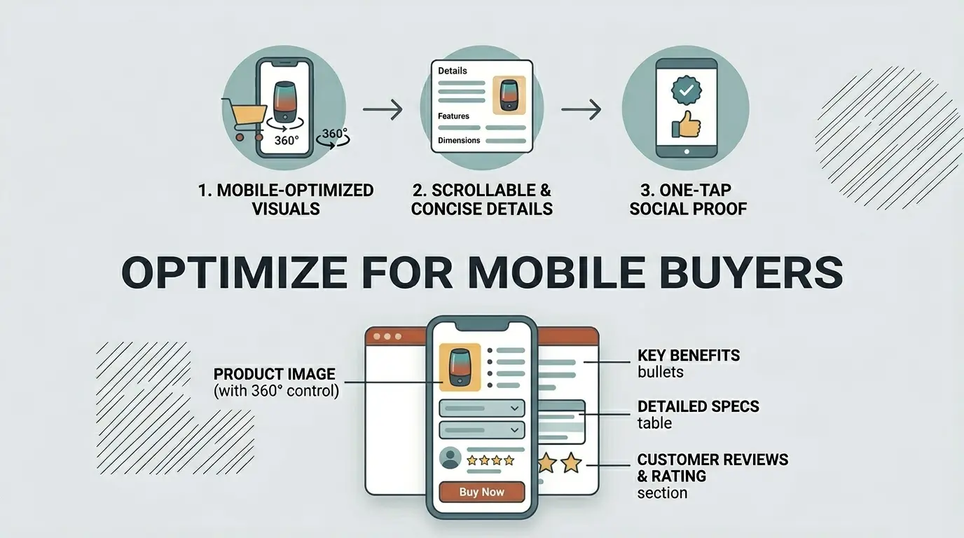
More than three-quarters of online shopping traffic now comes from mobile devices. If your store is awkward to use on a phone, you’re not competing for a small slice of visitors; you’re losing the majority. 53% of mobile visitors will abandon a site for mobiles that take longer than three seconds to load, and even a one-second slowdown can cut conversions by around 20%. This isn’t a minor consideration anymore.
Choose a Mobile-Friendly Theme
Desktop previews lie. After a ton of hard work, you might be proud looking at the perfect theme on your Windows browser; however, the moment you switch to a phone, everything will fall apart. This is a guaranteed problem for most store owners.
Make sure to go through your store on a mobile device, observing how the buttons are working, if the text can be read properly, and how long the images take to load. Anything feels off or annoying, you have to fix it asap, otherwise it’s going to feel the same to your customers.
75% of the traffic comes from mobile devices, making mobile optimization one of the single highest-impact changes any store can make. A theme that looks impressive on a desktop but performs poorly on mobile is ultimately hurting your conversion rate more than helping it.
Speed Up Your Store
Slow stores bleed conversions quietly and consistently. Before you upload your images, make sure to compress them, and along with that, install a caching plugin. Also, ensure that your hosting isn’t the bottleneck here. And if it worries you, don’t be, as these steps do not require any deep technical knowledge, yet they are going to have a noticeable impact on your load times and appearance.
Build Trust Throughout the Store
First-time customers don’t know you. They have no history with your store, no reason to assume everything will go smoothly, and plenty of reasons to be cautious about handing over their card details to a website they’ve never used before. Trust has to be actively built through visible signals placed in the right spots across your store.
Add Trust Signals
If you want your store to appear legitimate to your customers, make sure to display security badges next to the checkout button, payment method icons that are well-known, any acquired certifications, and any press your store has received.
These simplistic elements are bound to influence your customers’ purchasing decisions, especially the newer visitors who have been sitting on the fence.
Make Your Return Policy Easy to Find
A solid return policy that’s actually easy to find removes one of the most common reasons people hesitate before buying. If customers know they have a straightforward way to return something that doesn’t work out, the purchase suddenly feels a lot less risky.
Link to your policy from your product pages and again at checkout; those are the exact moments when a customer is weighing up whether to go through with it, and having that reassurance right there can tip the decision in your favor.
Use Upsells and Cross-Sells Wisely
Someone who has already decided to buy is in a completely different mindset than someone who’s still browsing. They’ve committed. They’re already mentally past the “should I?” stage, which makes them far more open to considering something additional, as long as it feels relevant and not pushy.
Add Related Products
Suggesting other products that are related on the cart pages makes it easier for customers to find what they might consider getting alongside the main purchase. The key here is to keep your recommendations relevant to what they are buying, just make sure not to overcrowd the page with a ton of options.
Offer Order Bumps at Checkout
An order bump is a small, well-matched offer that appears at the checkout stage, an accessory, an upgrade, a protection plan, something that makes clear sense with what’s already in the cart. Because the customer is already in buying mode, a relevant bump at this point gets accepted far more often than you might expect. The key is keeping it genuinely complementary rather than tacking on something random just to increase the order value.
Final Thoughts
In the end, you must accept the fact that you can’t just transform your WooCommerce store overnight with just a single change. If you truly want to make things work, you have to go through each part of the buying process one by one, keeping an eye on any section that involves friction.
Once identified, you must fix those issues one at a time. Although one problem itself may not seem highly impactful, collectively, they are bound to take your sales down. So fixing all of these issues one at a time will lead to having a smooth checkout, strong product pages, transparent pricing, and visible trust signals.
Start with checkout since that’s where the most sales are already being lost. Work through product pages next, then pricing, then trust signals. Measure what changes as you go. A store built around how real customers actually shop will always outperform one that was never really set up with them in mind.
FAQ’s
1. Why do customers abandon their carts?
The most common reasons are unexpected shipping costs at checkout, being forced to create an account, and a long or confusing checkout process. Fixing these three issues eliminates the majority of abandonment.
2. Do I really need to optimize my store for mobile?
Yes. The majority of online shoppers now browse and buy on their phones. If your store is slow, hard to navigate, or difficult to check out on mobile, you are losing sales every single day.
3. How much does page speed affect my conversion rate?
A great deal. Even a one-second delay can noticeably drop conversions, and many users will leave before a slow page finishes loading. Compress images, use caching, and choose reliable hosting as your first steps.
4. Should I require customers to create an account at checkout?
No. Forced account creation is one of the top reasons people abandon carts. Always offer guest checkout and invite account creation after the purchase is complete.
5. What trust signals should I add to my WooCommerce store?
Focus on the basics: security badges near the checkout button, recognizable payment icons, genuine customer reviews, and a clearly visible return policy. Together, these give new visitors the confidence to buy.